Creating LiveView Modals with Tailwind CSS and AlpineJS
Our last article explored how to use LiveView with AlpineJS. In this article, we will use LiveView along with AlpineJS and Tailwind CSS to create a production-ready modal component. That is, a modal that smoothly transitions into and out of view and is able to survive LiveView reconnects.
The final product will look like this:

We will use TailwindUI to get a polished app experience. TailwindUI is a paid-for, but reasonably priced, set of pre-built Tailwind CSS components that can be copied and pasted into your application. You just need to customize the styles for your app and add some AlpineJS code. We will leverage a set of sample TailwindUI components in this article (with permission.)
You can find the code for our sample application on GitHub. We will be taking it one piece at a time, but it might be useful to glance over the code as a whole, so as not to lose the forest for the trees. The relevant files are team_live.ex, team_live.html.leex, modal_component.ex, modal_component_alternate.ex, router.ex, and root.html.leex (for the dropdown).
This article was written with Phoenix LiveView 0.14.1.
Our Toolset #
Phoenix LiveView #
We are going to assume that you already have some understanding of Phoenix LiveView. If you are just getting started with LiveView, I would recommend the LiveView courses from Grox.io and Pragmatic Studio.
Tailwind CSS #
Tailwind CSS is a utility-first CSS framework. It takes a different approach to CSS where most of your styling is built up from small “utility classes” that you specify directly in your HTML. For example, you might specify something like class="mt-8 pt-5 border-t border-gray-200" on a div, which would create a light gray top border line with a top margin of 8 and a top padding of 5.
With Tailwind, most of your CSS is specified in your HTML. You can create your own custom classes from Tailwind utilities, but this is the exception, rather than the rule. It is more typical when using Tailwind with LiveView to extract out your markup and CSS into LiveComponents and helper functions for commonly used UI elements like buttons or modals, as we will see in this article.
To learn about Tailwind CSS you can find screencasts from Adam Watham, the creator of Tailwind, on the Tailwind site and on YouTube. Scrimba also offers a free Tailwind course.
AlpineJS (a.k.a., Alpine.js) #
AlpineJS is great for adding those small touches of JavaScript to LiveViews that make our interfaces come alive. AlpineJS works especially well with Tailwind CSS to add transitions to our elements. For example, an off-screen sidebar sliding into place or a modal growing and fading-in to view.
AlpineJS is sometimes called the Tailwind for JavaScript, as it allows you to place JavaScript code directly in your markup. We talked extensively about using AlpineJS with LiveView in our last article, but let’s go over a simple example to review the basics.
LiveView integration with AlpineJS #
LiveView added integration with AlpineJS in 0.13.3, allowing you to use Alpine JavaScript code in your LiveViews without the commonly needed phx-update="ignore" attribute to fence off JS code from LiveView. In order to enable the Alpine integration you need to initialize LiveSocket in your app.js with the dom property like this:
let liveSocket = new LiveSocket('/live', Socket, {
  dom: {
    onBeforeElUpdated(from, to) {
      if (from.__x) {
        window.Alpine.clone(from.__x, to)
      }
    }
  },
  params: {
    _csrf_token: csrfToken
  },
  hooks: Hooks
})
Simple Alpine Example #
Here we have a simple counter. The count is displayed as users click Increment and Decrement buttons. Not very interesting, but it will serve to demonstrate the basic AlpineJS directives and structure.
<div id="counter"
     x-data="{count: 0}"
     x-init="() => {
        $watch('count', value => {
          console.log('The count is now ' + value)
        })
      }">
  <h1>The count is: <span x-text="count"></span></h1>
  <h1 x-show="count > 100">The count is greater than 100</h1>
  <button x-on:click="count = count - 1"> Decrement </button>
  <button @click="count = count + 1"> Increment </button>
</div>
An Alpine component scope is declared on an HTML element with x-data. It is initialized with a JavaScript object that can contain data properties and functions. In this case we initialize our Alpine component with a count property of 0. The scope, and hence the visibility of the x-data properties, extends to children of the element upon which it is declared.
Our x-data declaration is followed by an optional x-init, which runs a JavaScript expression when the component is initialized. The expression can contain multiple JavaScript statements, which can use the properties declared in x-data as well as Alpine “magic properties”.
There are 6 magic properties in Alpine, including $el to get the root element of the component, $dispatch to dispatch a JavaScript CustomEvent, and $watch to watch and react to changes in component properties.
In our example x-init, we are using $watch to watch for changes to the count property and outputting a console log whenever that happens
Our count is displayed in an h1 tag. The x-text directive updates the innerText of an element. There is also x-html for setting innerHTML and x-bind for setting element attributes.
We display an additional h1 when the count is greater than 100 using x-show. x-show controls whether an element is shown or not based on the result of a given JavaScript statement. If the statement is true it shows the element, if it is false, the element is hidden. It does this by toggling the display: none; style on the element.
Our buttons declare click event handlers. The x-on Alpine directive is used to register an event handler. When the handler is triggered, the associated JavaScript expression is executed. The syntax is x-on:[event]="[expression]". We specify x-on:click="count = count - 1" to decrement the count whenever the button is clicked. We also demonstrate the short form of declaring x-on event handlers using the @[event] syntax. In this case, we use @click="count = count + 1" to increment the count when the Increment button is clicked.
Not shown in this example, but vital to our purposes here… Alpine includes a set of x-transition directives for applying CSS classes to various stages of an element’s transition. This could be visual effects when an element changes from hidden to displayed or from offscreen to onscreen. We will look at an example of that next.
To learn more about AlpineJS, you can get started by reading the Alpine Readme on Github, checking out some intro articles, and doing the AlpineJS tutorial on Scrimba.
A Simple Dropdown Example #
Before exploring the more complex modal case, let’s take a look at a simple dropdown example. A dropdown can be implemented entirely on the client side, without any interaction with the server. Which is ideal, as any lag in opening and closing the dropdown would detract from the user’s experience.

First let’s look at the Alpine code, without any CSS or transitions so, we can focus on the mechanics of opening and closing the modal.
<div x-data="{ open: false }">
  <div>
    <button @click="open = !open">
      <img src="avatar.jpg" alt="" />
    </button>
  </div>
  <div x-show="open"
       x-cloak>
    <div>
      <a href="#">Your Profile</a>
      <a href="#">Settings</a>
      <a href="#">Sign out</a>
    </div>
  </div>
</div>
Here we declare the Alpine.js component scope with the x-data attribute, initializing open to false. Next we implement a @click event handler on a button to toggle open. And finally we use x-show to specify that the menu be shown when open is true.
Take note of the x-cloak attribute following x-show. This hides the element on first render, before Alpine initializes. Without it we would see the dropdown menu flash into view when the LiveView is first loaded or reloaded.
For x-cloak to work, we need to add the x-cloak global style to our app.css file:
@tailwind base;

[x-cloak] {
  display: none;
}

@tailwind components;
@tailwind utilities;
Now let’s add in the CSS classes and transitions to our dropdown HTML.
<div class="ml-3 relative"
     x-data=" { open: false }">
  <div>
    <button class="max-w-xs flex items-center text-sm rounded-full
                      text-white focus:outline-none focus:shadow-solid"
            id="user-menu"
            aria-label="User menu"
            aria-haspopup="true"
            @click="open = !open">
      <img class="h-8 w-8 rounded-full" src="avatar.jpg" alt="" />
    </button>
  </div>
  <div class="origin-top-right absolute right-0 mt-2 w-48
              rounded-md shadow-lg"
        x-show="open"
        x-cloak
        x-transition:enter="transition ease-out duration-100"
        x-transition:enter-start="transform opacity-0 scale-95"
        x-transition:enter-end="transform opacity-100 scale-100"
        x-transition:leave="transition ease-in duration-75"
        x-transition:leave-start="transform opacity-100 scale-100"
        x-transition:leave-end="transform opacity-0 scale-95">
    <div class=" py-1 rounded-md bg-white shadow-xs"
          role="menu"
          aria-orientation="vertical"
          aria-labelledby="user-menu">
      <a href="#" class="block px-4 py-2 text-sm text-gray-700
                   hover:bg-gray-100" role="menuitem">Your Profile</a>
      <a href="#" class="block px-4 py-2 text-sm text-gray-700
                   hover:bg-gray-100" role="menuitem">Settings</a>
      <a href="#" class="block px-4 py-2 text-sm text-gray-700
                   hover:bg-gray-100" role="menuitem">Sign out</a>
    </div>
  </div>
</div>
The x-transition attributes are AlpineJS directives that apply CSS classes to an element, Tailwind CSS utility classes in this case, at various stages of an element’s transition.
They are rather self-explanatory, but here are the details of each from the Alpine.js documentation:
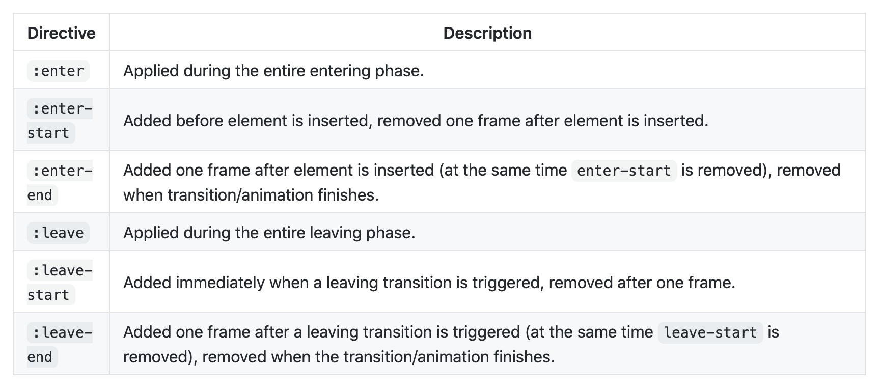
In our dropdown example, we specify an enter transition of 100 milliseconds, easing out, and transitioning the opacity from 0 to 100 and the scale from 95% to 100%. The leave transition reverses the enter transition, but over 75 milliseconds and easing in. “Ease out” means that the transition will start fast and slow down towards the end. “Ease in” means that it will start slow and speed up.
Modals with Transitions #
The dropdown example is simple, because everything happens on the client side, the server isn’t involved at all so the dropdown will respond instantaneously to the user’s clicks.
A modal is more complicated because it is usually activated from the server side in response to a user action. A common practice with LiveViews is to conditionally add and remove a modal from the DOM. This works and it is simple, but it makes for jarring transitions as the modal suddenly appears and disappears.
In this section we will demonstrate how to create a modal that smoothly transitions in and out of view. Our modal will be a simple message modal with one or two buttons, but the same principles apply to any modal card or form.
We will make our modal transition in for 300 milliseconds and out for 200 ms, but to get a better look at what is happening, here it is slowed down to transition in for 1 second and out for 1 second.

We will implement our modal as a reusable stateful component that can be initialized with the modal’s title, body text, button text, and callbacks for the button clicks. Since it is a stateful component, the component will capture the button clicks with event handlers and communicate with the host LiveView using send/2.
Showing and Hiding the Modal #
There are many ways to show and hide a modal. The simplest is to conditionally render it without any transitions, as mentioned above. We will explore a couple other options for rendering modals with transitions.
Using the ModalComponent #
The Modal LiveComponent we will create here is used in the render/1 function or .leex template of the hosting LiveView. It can be placed below the LiveView’s HTML and called like this.
<%= live_component(@socket, ModalComponent,
      id: "confirm-delete-member",
      show: @live_action == :delete_member,
      title: "Delete Member",
      body: "Are you sure you want to delete team member
         '#{@member_to_delete && @member_to_delete.name || ""}'?",
      right_button: "Delete",
      right_button_action: "delete-member",
      left_button: "Cancel",
      left_button_action: "cancel-delete-member")
%>
Notice the show assign. This controls whether the modal will be shown or not. In this case it is set to show the modal when the live_action assign is equal to the :delete_member action.
Inside our modal component’s HTML we will use show assign to show and hide the modal.
Show/hide modal based on @show assign #
Let’s look at the ModalComponent’s HTML with the CSS and transitions stripped out, so we can focus on the show/hide mechanism.
<div id="<%= @id %>"
     phx-hook="Modal"
     x-data="{ open: <%= @show %> }"
     x-init="() => {
          $watch('open', isOpen => {
            if (!isOpen) {
              modalHook.modalClosing(<%= @leave_duration %>)
            }
          })
        }"
     @keydown.escape.window="if (connected) open = false"
     x-show="open"
     x-cloak>
  <div>
    <div x-show="open"
         x-cloak>
      <!-- BACKDROP -->
    </div>
    <div x-show="open"
         x-cloak
         @click.away="if (connected) open = false">
      <!-- MODAL CARD -->
      <div>
        <button type="button"
                phx-click="right-button-click"
                phx-target="#<%= @id %>"
                @click="if (connected) open = false">
          <%= @right_button %>
        </button>
        <%= if @left_button != nil do %>
        <button type="button"
                phx-click="left-button-click"
                phx-target="#<%= @id %>"
                @click="if (connected) open = false">
          <%= @left_button %>
        </button>
        <% end %>
      </div>
    </div>
  </div>
</div>
<template phx-hook="ConnectionStatus"></template>
At the top, we declare an x-data component scope and initialize the open property to the LiveComponent’s @show assign.
In x-init we setup a $watch on open such that the Modal hook function modalClosing will be called when the open state changes from true to false.
Further down, we see that the modal is shown based on the state of the open property using x-show. As with the dropdown, we need to use the x-cloak attribute to prevent the modal from flashing when it is first rendered.
We set @keydown.escape.window and @click.away handlers to set open to close when the user hits the escape key or clicks away from the modal. We also add @click handlers in conjunction with the phx-click handlers on the buttons to simultaneously set open to false whenever there is a button click.
The click handlers specify if (connected) open = false to only close the modal if we are connected, as we don’t want the user to take any action while the LiveSocket is disconnected from the LiveView.
The connected boolean is set on window and made available globally from the ConnectionStatus hook, which we will see in a moment. It doesn’t matter where we put the ConnectionStatus hook in the DOM, so we register it on a template element below the modal markup.
Hooks #
Modal hook #
The Modal hook modalClosing function is called from our watch when open changes from true to false. The purpose of modalClosing is to give our modal time to complete its leave transitions, before telling the LiveComponent that the modal has closed.
Hooks.Modal = {
  mounted() {
    window.modalHook = this
  },
  destroyed() {
    window.modalHook = null
  },
  modalClosing(leave_duration) {
    // Inform modal component when leave transition completes.
    setTimeout(() => {
      var selector = '#' + this.el.id
      if (document.querySelector(selector)) {
        this.pushEventTo(selector, 'modal-closed', {})
      }
    }, leave_duration);
  }
}
The modalClosing function delays for leaveDuration milliseconds and then pushes the modal-closed event to the server, which is the LiveView’s cue to move on. This is what gives our modal’s leave transitions time to complete.
ConnectionStatus hook #
The ConnectionStatus hook tracks the socket connection status and sets window.connected accordingly.
Hooks.ConnectionStatus = {
  mounted() {
    window.connected = true
  },
  disconnected() {
    window.connected = false
  },
  reconnected() {
    window.connected = true
  }
}
An alternative implementation #
We will look at the transition code in a moment, but first I would like to outline an alternate way to showing and hiding the modal. In the above approach, the modal is always in the DOM, it is just shown and hidden based on the @show assign. So after the modal is downloaded as part of the enclosing HTML, all that is required for the modal’s show state to change is for the @show assign value to be sent down to the client .
A different way to approach the problem is to add or remove the entire modal HTML whenever we want to show or hide the modal. Thus the entire modal will be sent to the client whenever we want to show it. This is how that can be done:
<%= if @show do %>
<div id="<%= @id %>"
     phx-hook="Modal"
     x-data="{ open: false }"
     x-init="() => {
       setTimeout(() => open = true, 0)
       $watch('open', isOpen => {
         if (!isOpen) {
           modalHook.modalClosing(<%= @leave_duration %>)
         }
       })
     }"
     @keydown.escape.window="if (connected) open = false"
     x-show="open"
     x-cloak>
  <div>
    <div x-show="open"
         x-cloak>
      <!-- BACKDROP -->
    </div>
    <div x-show="open"
         x-cloak
         @click.away="if (connected) open = false">
      <!-- MODAL CARD -->
      <div">
        <button type="button"
                phx-click="right-button-click"
                phx-target="#<%= @id %>"
                @click="if (connected) open = false">
          <%= @right_button %>
        </button>
        <%= if @left_button != nil do %>
        <button type="button"
                phx-click="left-button-click"
                phx-target="#<%= @id %>"
                @click="if (connected) open = false">
          <%= @left_button %>
        </button>
        <% end %>
    </div>
  </div>
</div>
<template phx-hook="ConnectionStatus"></template>
<% else %>
<div class="hidden"></div>
<% end %>
This is much the same as before. The primary difference is that the modal is added and removed based on the state of the show assign. If @show is true, the modal HTML will be displayed. If it is false, a hidden div will be used.
In addition, open is initialized to false and then set to true after a short delay in x-init. This transition of open from false to true triggers x-show to begin the transition of the modal to the open state.
This approach will make the initial parent DOM less heavy, but will require that the modal HTML be transferred to the client every time it is to be shown. Whereas the first approach always includes the modal in the parent DOM, but only requires the show boolean to be transferred to the client to display the modal.
Transitions #
Here is the entire HTML for the first approach with all of the CSS classes and Alpine x-transition directives. (This is going to get a bit messy, so it might be easier to look at the modal_component.ex source directly.)
Notice that we are doing two transitions. One for the background, which fades in and out. Another for the modal card which fades in and out and grows and shrinks between 95% to 100% to give it a bit of movement.
We use the @enter_duration and @leave_duration assigns so that the durations can be changed in one place in the LiveComponent..
<div id="<%= @id %>"
     phx-hook="Modal"
     x-data="{ open: <%= @show %> }"
     x-init="() => {
                 $nextTick(() => $refs.modalRightButton.focus())
                 $watch('open', isOpen => {
                   console.log('WATCH OPEN = ' + isOpen)
                   if (!isOpen) {
                     modalHook.modalClosing(<%= @leave_duration %>)
                   }
                 })
               }"
     @keydown.escape.window="if (connected) open = false"
     x-show="open"
     x-cloak>
  <div class="z-50 fixed bottom-0 inset-x-0 px-4 pb-4 sm:inset-0 sm:flex sm:items-center sm:justify-center">
    <!-- BACKDROP -->
    <div x-show="open"
         x-cloak
         x-transition:enter="ease-out duration-<%= @enter_duration %>"
         x-transition:enter-start="opacity-0"
         x-transition:enter-end="opacity-100"
         x-transition:leave="ease-in duration-<%= @leave_duration %>"
         x-transition:leave-start="opacity-100"
         x-transition:leave-end="opacity-0"
         class="fixed inset-0 transition-opacity">
      <div class="absolute inset-0 <%= @background_color %> <%= @background_opacity %>"></div>
    </div>
    <div x-show="open"
         x-cloak
         @click.away="if (connected) open = false"
         x-transition:enter="ease-out duration-<%= @enter_duration %>"
         x-transition:enter-start="opacity-0 translate-y-4 sm:translate-y-0 sm:scale-95"
         x-transition:enter-end="opacity-100 translate-y-0 sm:scale-100"
         x-transition:leave="ease-in duration-<%= @leave_duration %>"
         x-transition:leave-start="opacity-100 translate-y-0 sm:scale-100"
         x-transition:leave-end="opacity-0 translate-y-4 sm:translate-y-0 sm:scale-95"
         class="bg-white rounded-lg overflow-hidden shadow-xl transform transition-all sm:max-w-lg sm:w-full"
         role="dialog"
         aria-modal="true"
         aria-labelledby="modal-headline"
         aria-describedby="modal-description">
      <div class="bg-white px-4 pt-5 pb-4 sm:p-6 sm:pb-4">
        <div class="sm:flex sm:items-start">
          <div class="mx-auto flex-shrink-0 flex items-center justify-center h-12 w-12 rounded-full bg-red-100 sm:mx-0 sm:h-10 sm:w-10">
            <svg class="h-6 w-6 text-red-600"
                 fill="none"
                 viewBox="0 0 24 24"
                 stroke="currentColor">
              <path stroke-linecap="round"
                    stroke-linejoin="round"
                    stroke-width="2"
                    d="M12 9v2m0 4h.01m-6.938 4h13.856c1.54 0 2.502-1.667 1.732-3L13.732 4c-.77-1.333-2.694-1.333-3.464 0L3.34 16c-.77 1.  333.192 3 1.732 3z" />
            </svg>
          </div>
          <div class="mt-3 text-center sm:mt-0 sm:ml-4 sm:text-left">
            <h3 class="text-lg leading-6 font-medium <%= @title_color %>"
                      id="modal-headline">
                        <%= @title %>
                      </h3>
            <div class="mt-2">
              <p class="text-sm leading-5 <%= @body_color %>"
                 id="modal-description">
                <%= @body %>
              </p>
            </div>
          </div>
        </div>
      </div>
      <div class="bg-gray-50 px-4 py-3 sm:px-6 sm:flex sm:flex-row-reverse">
        <span class="flex w-full rounded-md shadow-sm sm:ml-3 sm:w-auto">
          <button type="button"
                  phx-click="right-button-click"
                  phx-target="#<%= @id %>"
                  class="inline-flex justify-center w-full rounded-md border border-transparent px-4 py-2 bg-<%= @right_button_color       %>-600 text-base leading-6 font-medium text-white shadow-sm hover:bg-<%= @right_button_color %>-500   focus:outline-none     focus:border-<%= @right_button_color %>-700 focus:shadow-outline-<%= @right_button_color %>   transition ease-in-out     duration-150 sm:text-sm sm:leading-5"
                  x-ref="modalRightButton"
                  @click="if (connected) open = false">
            <%= @right_button %>
          </button>
        </span>
        <%= if @left_button != nil do %>
        <span class="mt-3 flex w-full rounded-md shadow-sm sm:mt-0 sm:w-auto">
          <button type="button"
                  phx-click="left-button-click"
                  phx-target="#<%= @id %>"
                  class="inline-flex justify-center w-full rounded-md border border-gray-300 px-4 py-2 bg-white text-base leading-6       font-medium text-gray-700 shadow-sm hover:text-gray-500 focus:outline-none focus:border-blue-300       focus:shadow-outline-blue transition ease-in-out duration-150 sm:text-sm sm:leading-5"
                  @click="if (connected) open = false">
            <%= @left_button %>
          </button>
        </span>
        <% end %>
      </div>
    </div>
  </div>
</div>
<template phx-hook="ConnectionStatus"></template>
ModalComponent event handlers #
Let’s turn now to the ModalComponent’s Elixir code.
The ModalComponent is a stateful LiveComponent, so it handles the button clicks from the modal. These are forwarded by the ModalComponent to the hosting LiveView using send/2 and handled in the LiveView with handle_info/3 message handlers.
The ModalComponent’s modal-closed event handler handles the event sent by the Modal hook’s modalClosing function when the UI transitions are due to complete. The handler in turn sends a :modal_closed message to the hosting LiveView to “remove” the modal.
@impl Phoenix.LiveComponent
def handle_event("modal-closed", _params, socket) do
  # Handle event fired from Modal hook leave_duration-milliseconds
  # after open transitions from true to false.
  send(self(), {__MODULE__, :modal_closed, %{id: socket.assigns.id}})

  {:noreply, socket}
end

def handle_event(
      "right-button-click",
      _params,
      %{
        assigns: %{
          right_button_action: right_button_action,
          right_button_param: right_button_param,
          leave_duration: leave_duration
        }
      } = socket
    ) do
  send(
    self(),
    {__MODULE__, :button_pressed,
      %{action: right_button_action, param: right_button_param}}
  )

  # send_after(self(), {__MODULE__, :modal_closed, %{id: socket.assigns.id}}, leave_duration)

  {:noreply, socket}
end

def handle_event(
      "left-button-click",
      _params,
      %{
        assigns: %{
          left_button_action: left_button_action,
          left_button_param: left_button_param,
          leave_duration: leave_duration
        }
      } = socket
    ) do
  send(
    self(),
    {__MODULE__, :button_pressed,
      %{action: left_button_action, param: left_button_param}}
  )

  # send_after(self(), {__MODULE__, :modal_closed, %{id: socket.assigns.id}}, leave_duration)

  {:noreply, socket}
end
Note, if you are paranoid that the "modal-closed" event might not be sent by the Modal hook (e.g., if the connection is dropped in the 200 ms between the button click and the leave transition completion), you could send a redundant :modal_closed message to the LiveView from the button click handlers using send_after/3 (shown commented out above). If you do so, the LiveView will receive the message twice in most cases, but it should not matter.
Initializing the ModalComponent #
The modal component is initialized with a @defaults property that is used to set assigns in mount. Then the default update function will merge component assigns passed into the LiveComponent, overriding default values.
@defaults %{
  show: false,
  enter_duration: 300,
  leave_duration: 200,
  background_color: "bg-gray-500",
  background_opacity: "opacity-75",
  title_color: "text-gray-900",
  body_color: "text-gray-500",
  left_button: nil,
  left_button_action: nil,
  left_button_param: nil,
  right_button: nil,
  right_button_color: "red",
  right_button_action: nil,
  right_button_param: nil
}

@impl Phoenix.LiveComponent
def mount(socket) do
  {:ok, assign(socket, @defaults)}
end
LiveView implementation - using ModalComponent #
Now let’s look at the implementation of the LiveView that hosts the modal.
When displaying any kind of modal, or any LiveView or LiveComponent for that matter, we need to be mindful that the connection can drop at any moment. If this happens we need to rebuild the modal, otherwise it will just disappear, which would be a frustrating experience for the end user. This section will explore how we can go about doing that.
To simulate a connection being dropped and reestablished when a modal is opened, set
code_reloader: falsein the Endpoint configuration in your dev.exs configuration file.Then while your modal is being displayed, kill your server and restart it with
mix phx.server. If you’ve done your job correctly, the modal will not flash or disappear. It will be rock solid, appearing as if nothing happened.
When the LiveSocket is disconnected, the modal should stay up, but it should not react to button clicks. Once the connection is reestablished, the modal should again operate as normal. Here is a demonstration:
Calling the component #
As we saw earlier, whether a modal is shown or not is based on the state of the live_action assign, which is used to set the ModalComponent’s show assign.
<%= live_component(@socket, ModalComponent,
      id: "confirm-delete-member",
      show: @live_action == :delete_member,
      title: "Delete Member",
      body: "Are you sure you want to delete team member
            '# {@member_to_delete && @member_to_delete.name || ""}'?",
      right_button: "Delete",
      right_button_action: "delete-member",
      left_button: "Cancel",
      left_button_action: "cancel-delete-member")
%>
Setting up routes with live_actions #
The live_actions are setup in the router. Each live route in your router.ex file can have an atom associated with it, which will be available as live_action in your LiveView assigns.
scope "/", ModalExampleWeb do
  pipe_through :browser

  live "/", PageLive, :index

  live "/team", TeamLive, :index
  live "/team/:id/delete-member", TeamLive, :delete_member
end
Here we have two live actions associated with the TeamLive LiveView: :index and :delete_member. The :index action is associated with the base page and :delete_member is associated with delete member confirmation modal.
Notice that we specify an :id in our :delete_member route. This will be used by the LiveView to remember which user we are trying to remove from the list, in case the connection drops and reconnects. When the socket reconnects we lose all of our server state (socket assigns). We can use URL parameters as one way to restore the state. Note, if we have a form in our modal, LiveView can restore it automatically.
mount #
mount/3 sets up the primary assigns that we will be using in the LiveView.
@impl Phoenix.LiveView
def mount(_params, _session, socket) do
  {:ok,
    assign(socket,
      team_members: members(),
      reconnected: get_connect_params(socket)["_mounts"] > 0,
      base_page_loaded: false,
      member_to_delete: nil
    )}
end
team_membersis a list of users and the teams they are on.reconnectedsays whether the socket has been reconnected or not.base_page_loadedis used to determine if the:indexpage was loaded before the modal. We only want to show the modal if the user displayed the modal via the index page, i.e., not if they reload the page or come in directly or through a bookmarked link.member_to_deletesaves the member on which the delete button was clicked.
Helper functions #
A few helper functions…
defp okay_to_show_modal?(socket) do
  %{assigns: %{base_page_loaded: base_page_loaded,
      reconnected: reconnected}} = socket

  !connected?(socket) || base_page_loaded || reconnected
end

defp push_patch_index(socket) do
  push_patch(
    socket,
    to: Routes.team_path(socket, :index),
    replace: true
  )
end

defp push_patch_delete_member_modal(socket, user_id) do
  push_patch(
    socket,
    to: Routes.team_path(socket, :delete_member, user_id),
    replace: true
  )
end
The okay_to_show_modal? function is used when we are set to display a modal. It determines whether it is okay to to do so or not. We want to show the modal if 1) we are in the initial render before the socket connects (to avoid screen flashes) , 2) we are connected and the base page has been loaded, or 3) we are connected following a reconnect.
The push_patch_index and push_patch_delete_member_modal functions are shorthand for the push_patch functions to navigate to the index and modal routes. We have chosen replace: true in both instances so we don’t pollute the browser history. If we did not choose to replace, setting replace to false, the user would encounter modals when they clicked back, which may surprise them.
Handling live_action routes #
A common pattern in LiveViews is to implement the handle_params function such that it calls apply_action/3 functions for each live action, passing the live_action and the params. This allows us to have a function head for each live_action using pattern matching.
@impl Phoenix.LiveView
def handle_params(params, _url, socket) do
  {:noreply, apply_action(socket, socket.assigns.live_action, params)}
end

@spec apply_action(Socket.t(), atom(), map()) :: Socket.t()
def apply_action(socket, :index, _params) do
  assign(socket, member_to_delete: nil, base_page_loaded: true)
end

def apply_action(socket, :delete_member, %{"id" => user_id}) do
  member =
    get_member(
      socket.assigns.team_members,
      String.to_integer(user_id)
    )

  if member && okay_to_show_modal?(socket) do
    assign(socket, member_to_delete: member)
  else
    push_patch_index(socket)
  end
end
In the apply_action function for the :index live action we set member_to_delete to nil because we are not currently considering the deletion of a member. And we set base_page_loaded to true, because we are coming in on the :index page.
In the apply_action function for the :delete_member live action we get the id from the URL parameter and use that to get the member that is being deleted so we can set the :member_to_delete socket assign. Then, if we have a valid member and okay_to_show_modal?/1 returns true then we will proceed by setting the :member_to_delete assign. Once we return the modal will be triggered to display, as @live_action == :delete_member.
If the member is nil or it is not okay to show the modal at this point then we will push_patch back to the index page and the modal will not be shown.
Event handler #
The "delete-member" event handler is called when the user clicks the Delete button on a member. This will cause for the delete member confirmation modal to be displayed. We display the modal by doing a push_patch to the team_path :delete_member route, passing the user id of the member to be deleted. The user id will be passed as part of the URL and used in the :delete_member apply_action function, as we saw above.
@impl Phoenix.LiveView
def handle_event("delete-member", %{"user-id" => user_id}, socket) do
  {:noreply, push_patch_delete_member_modal(socket, user_id)}
end
Message handlers #
We implement handle_info functions to handle the messages coming from the ModalComponent.
# Handle message from Remove Member confirmation modal ok button
def handle_info(
      {ModalComponent, :button_pressed, %{action: "delete-member"}},
      %{assigns: %{member_to_delete: member_to_delete,
          team_members: team_members}} = socket
    ) do
  team_members = delete_member(team_members, member_to_delete.user_id)

  {:noreply,
    socket
    |> assign(team_members: team_members)}
end

# Handle message from Remove User confirmation modal cancel button
def handle_info(
      {ModalComponent, :button_pressed,
        %{action: "cancel-delete-member", param: _}},
      socket
    ) do
  {:noreply, socket}
end

# Modal closed message
@impl Phoenix.LiveView
def handle_info(
      {ModalComponent, :modal_closed, %{id: "confirm-delete-member"}},
      socket
    ) do
  {:noreply, push_patch_index(socket)}
end
The modal sends messages to the hosting LiveView when buttons are clicked and when the modal is closed.
The "delete_member" button message handler is called when the OK button is clicked on the delete member confirmation modal. The function deletes the user and updates team_members in assigns, which will cause for the team member table to be re-rendered without the deleted member.
The "cancel-delete-member" button message handler is called when the modal’s cancel button is clicked. It does nothing, returning the socket unaltered.
Note that we don’t navigate away from the modal page in the button handlers, as we are still waiting for the UI transitions to complete. That is done in the :modal_closed message handler.
By the time the :modal_closed message handler is called the modal has completed its leave transition, making it safe to push patch back to the base index page.
Thats it! #
We created a beautiful LiveView modal with smooth enter and leave transitions using Tailwind CSS and AlpineJS. And we demonstrated how to make our modal survive LiveView reconnects to give our users a seamless experience.
Thanks to Henrik Nyh, Moxley Stratton, and Jim Freeze for their feedback.